Spunky & Scott
Clothing with an attitude
An online fashion boutique made specifically for boys from newborn to age 7.
What we did
- Logo
-
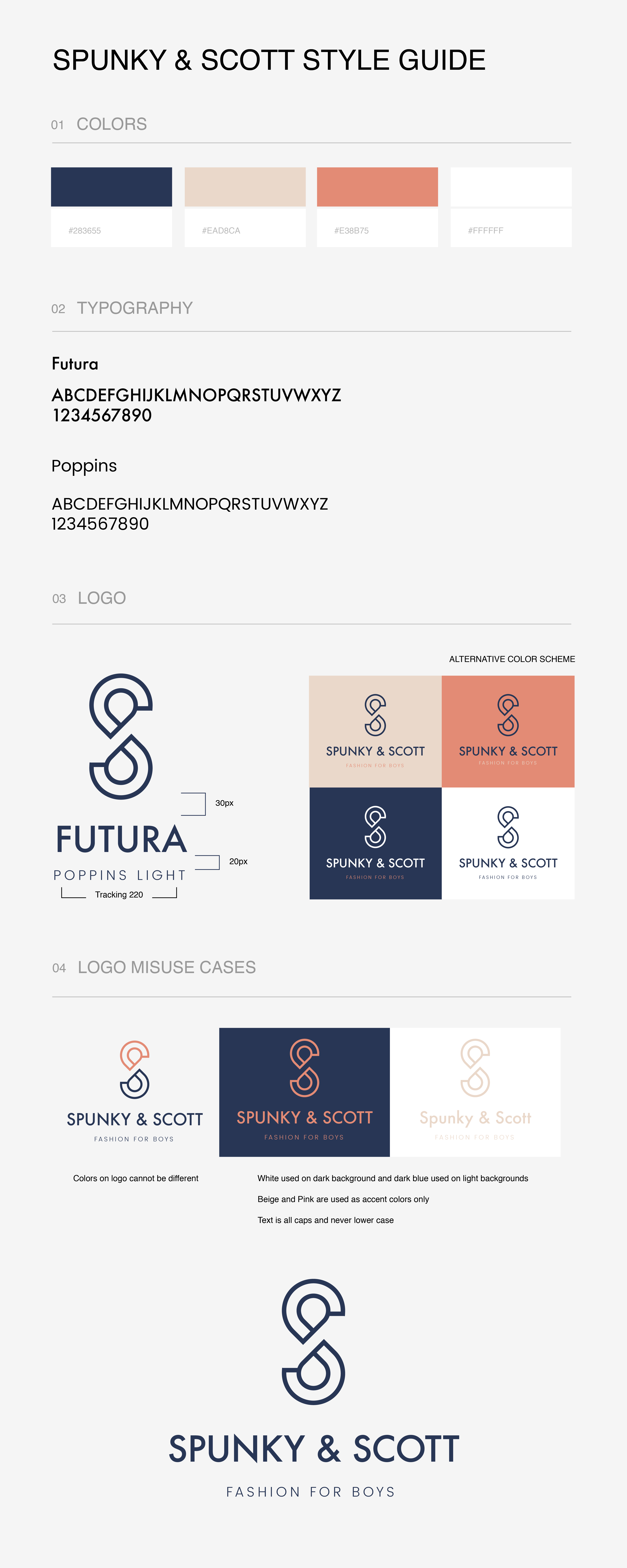
Style guide

The Opportunity
As a mom of two kids, the founder of Spunky & Scott realized there was a huge gap in the market for children, especially for infant and toddler boys, to be on-trend, edgy, and steer clear of the common dinosaur graphic tee look. However, they were struggling to determine a finalized logo that matched the aesthetic they were looking to portray. They engaged Hawke to help develop a logo and style guide to implement across their website, product tags, and shipping boxes.
The Solution
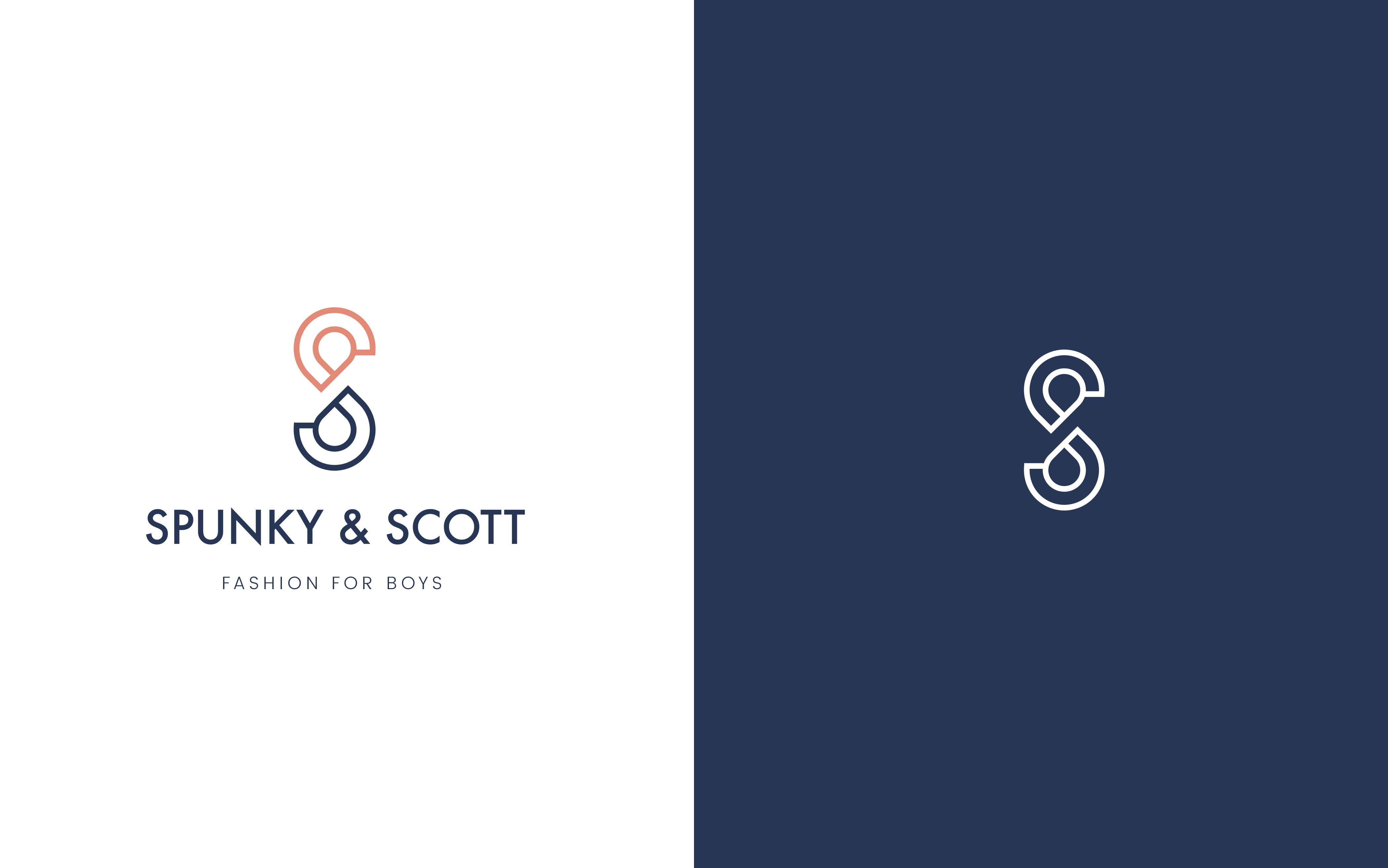
The biggest challenge creating the logo was in balancing edgy and masculine features with child- and mother-friendly elements. We wanted to create a unique icon that would not feel intrusive on the clothing tag, yet would connect with both demographics. This resulted in the use of straight edges and dark navy in the monogram logo, and typeface that emulated the more masculine vibe with the incorporation of a subtle beige and muted rose, which would appeal more to the mothers purchasing the clothing for their sons. The result: a brand that was both cool and upscale, yet eye-catching to the target demographics.

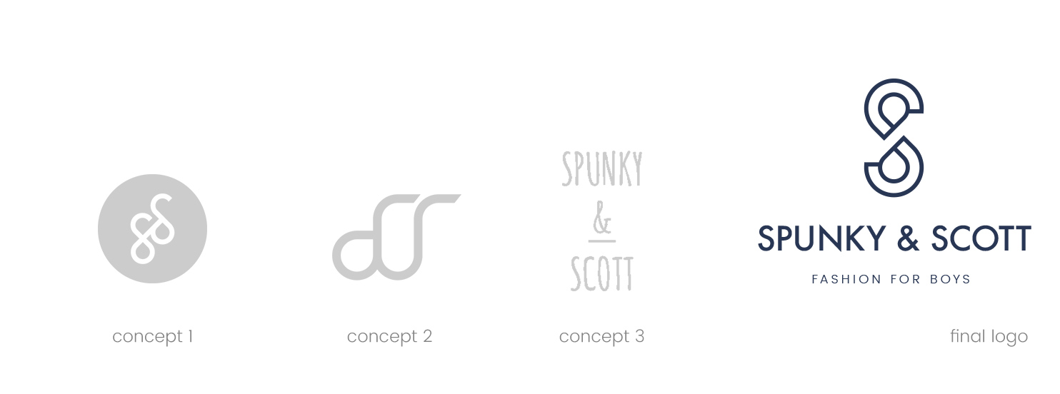
Logomark development
To make an edgy and eye-catching, yet non-intrusive logo that would be easily monogrammed onto clothing, we kept our designs simple, incorporating straight lines with overlapping S’s referring back to the brand name. The removal of the intersecting line allowed the S to be more legible. We incorporated a similar straight line font for the company name below the logo mark and used a color palette that spoke to both the target demographic (mothers) and secondary demographic (younger boys) creating a brand that was both enticing yet unique in its tone.

Typography
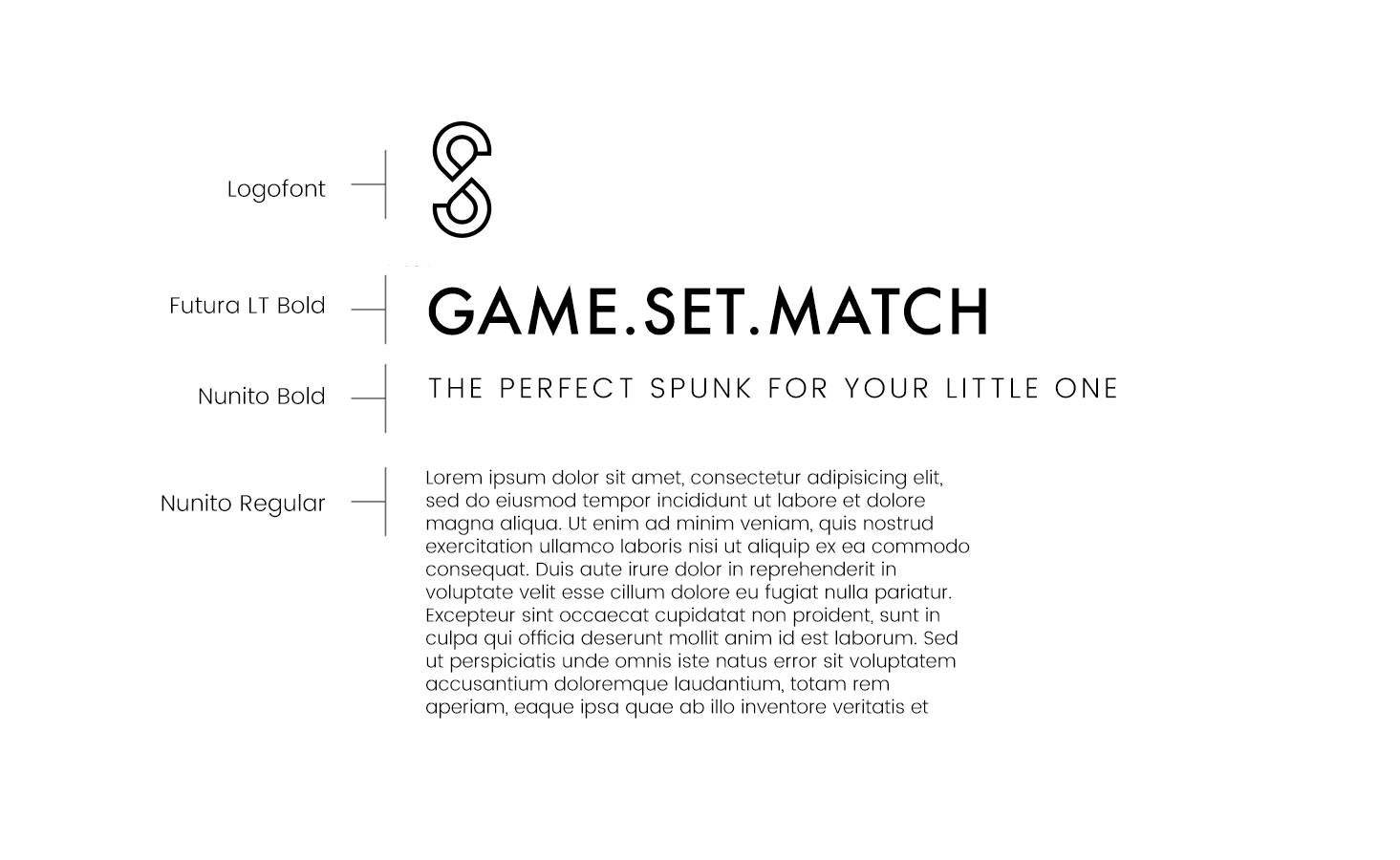
For Spunky & Scott’s typefaces we chose Futura and Poppins. For the company name and main headlines, we used Futura in a regular all caps letter weight to make a bold and strong correlation to the logo mark above. We then added the lighter and more rounded Poppins font as a supplementary accent to make it friendly and fun. The unique yet circular Poppins font adds a relatable, approachable, younger feel to the type treatments.


