OppJar
Give together, save together
An increasing number of kids are entering adulthood with little to no savings, and America’s wealth gap disproportionately affects low income communities. OppJar is here to change that through their crowdfunding platform, where anyone can invest in a child’s future and achievements.
What we did
- Naming
- Logo
-
Style guide

The Opportunity
When OppJar began working with Hawke Media, they were looking for a new company name along with a corresponding logo design. The challenge was to make both the name and logo mature, respectable, and timeless to convey the seriousness of the mission, while still being fun and warm, to accommodate the idea that families would also use it as sort of a social network for their child’s milestones.
The Solution
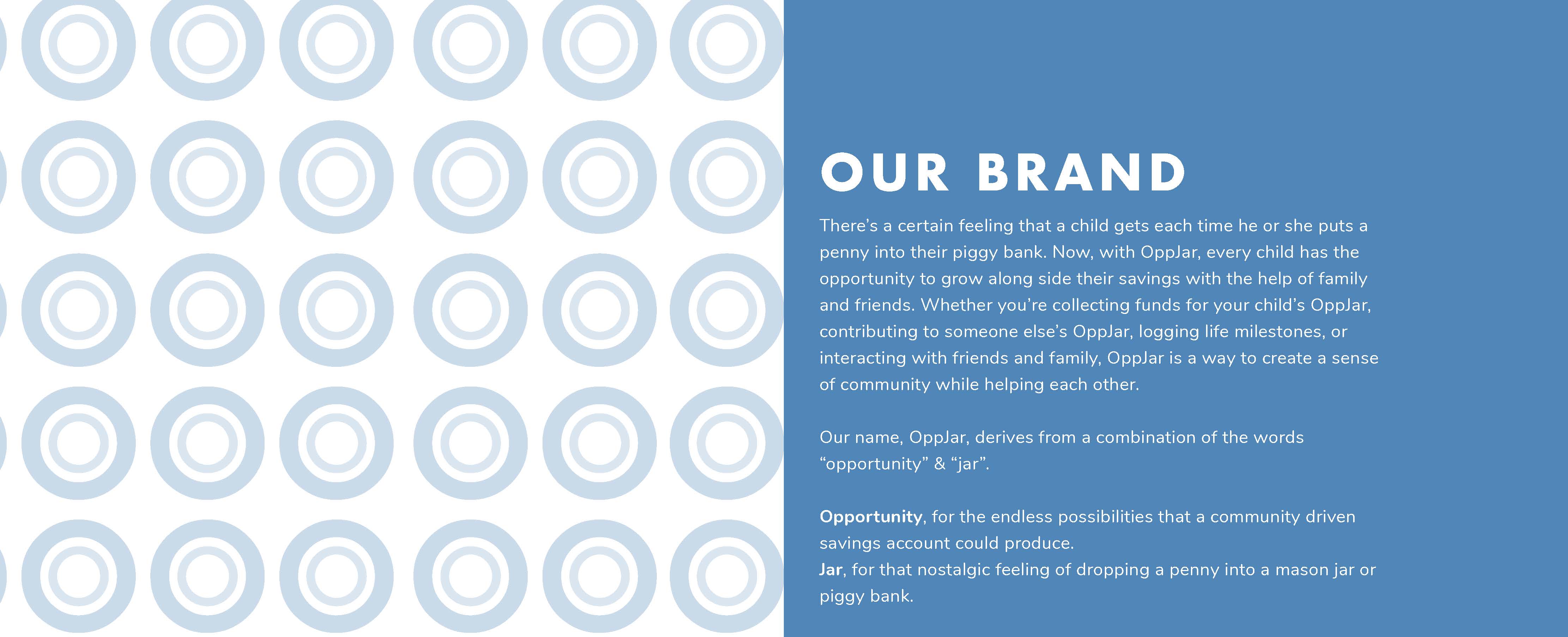
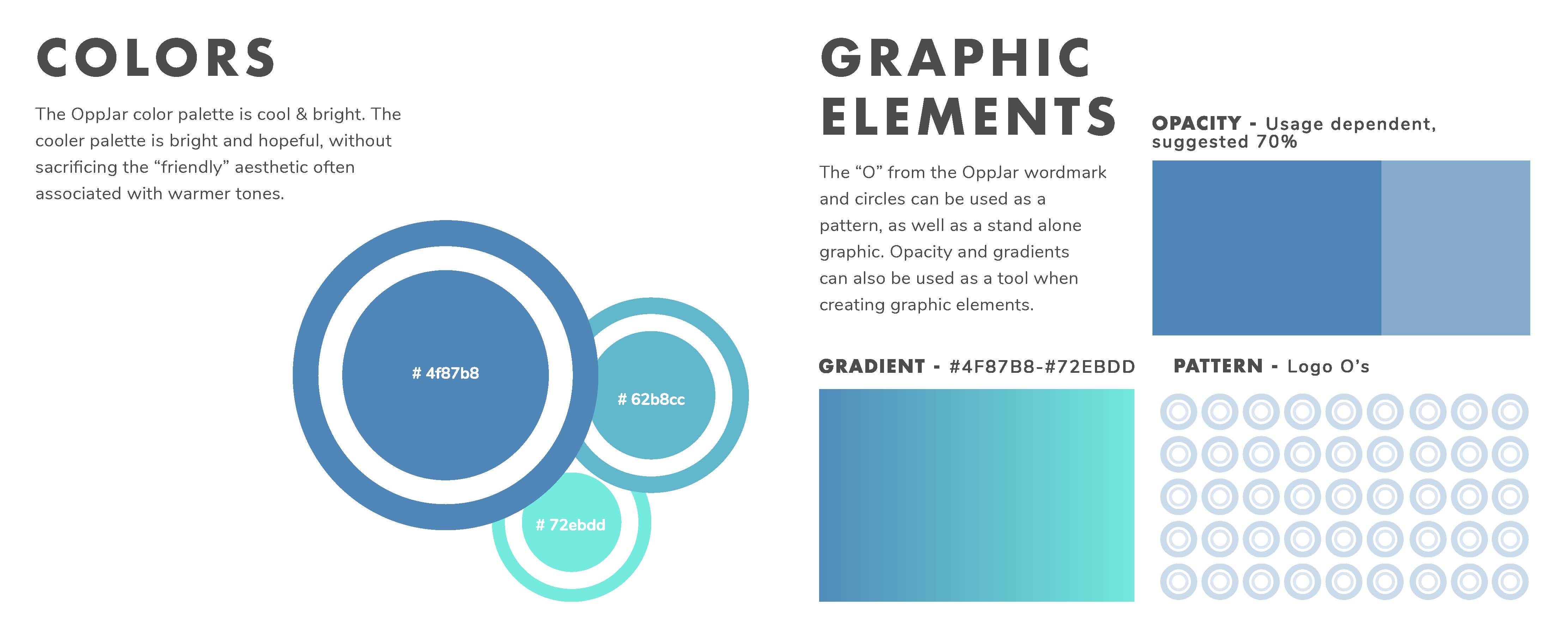
The name OppJar is short for Opportunity Jar, which encompasses all of the brand elements we wanted to highlight. Our aim was to capture the feeling of pride a child has when putting a penny into a savings jar and watching that jar fill over time. In the case of OppJar, those accumulated savings from the child’s network can also provide possibility and opportunity. The portmanteau name is modern, bold, and memorable, and the logo we designed encapsulates the same modern, bold, yet approachable feel – a simple, yet cool, color palette of muted blues along with an translucent pattern element consisting of the logo’s O emulating the top of a jar.

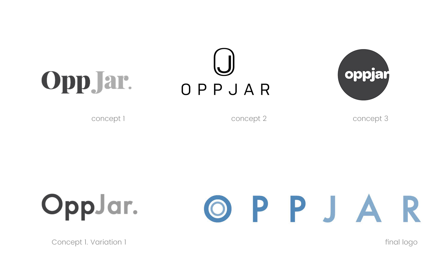
Logomark development
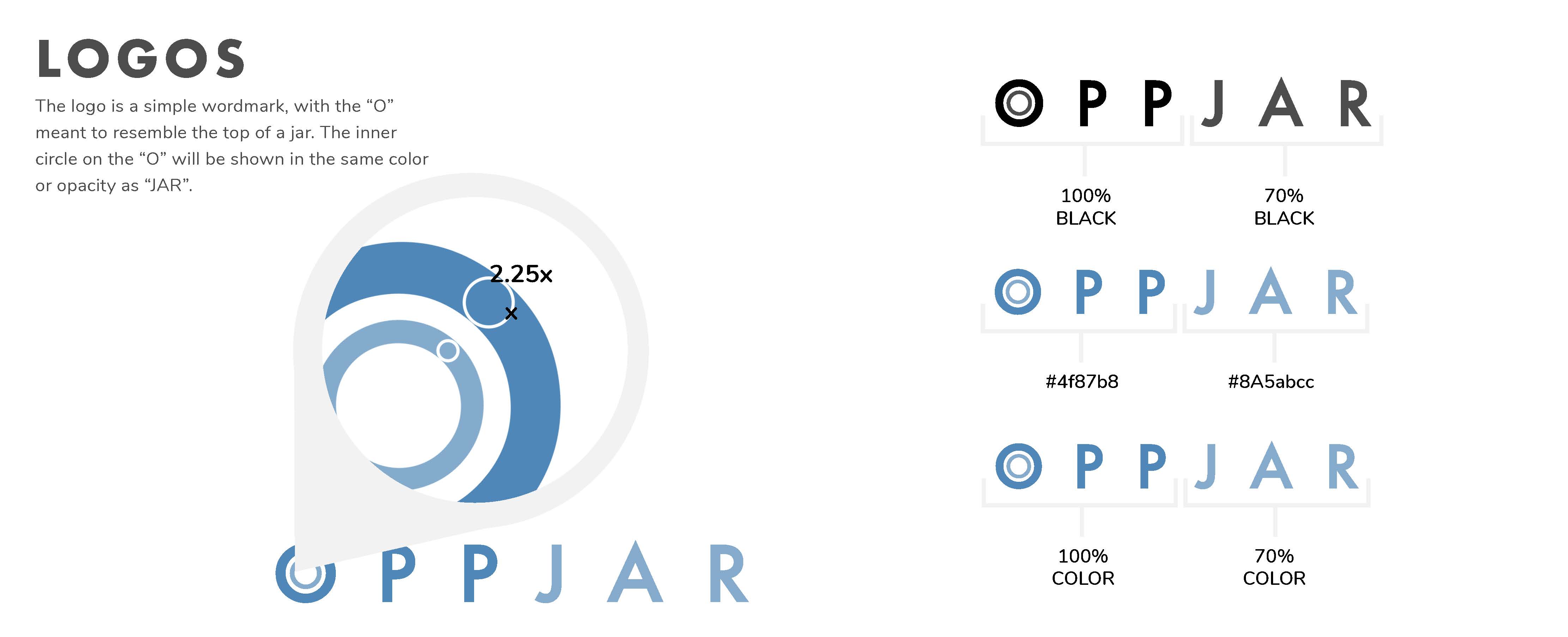
We used a wordmark with a small design element to keep the logo simple and mature. The “O” in “OppJar” represents the lid of a jar, and by making the inner circle of the “O” and “Jar” the same color, we ensured that “Opp” and “Jar” would be read together as one word, yet understood independently. We chose Futura for the logotype font because it conveys a bold and strong brand image, and added kerning to give it a fresher look.
Typography
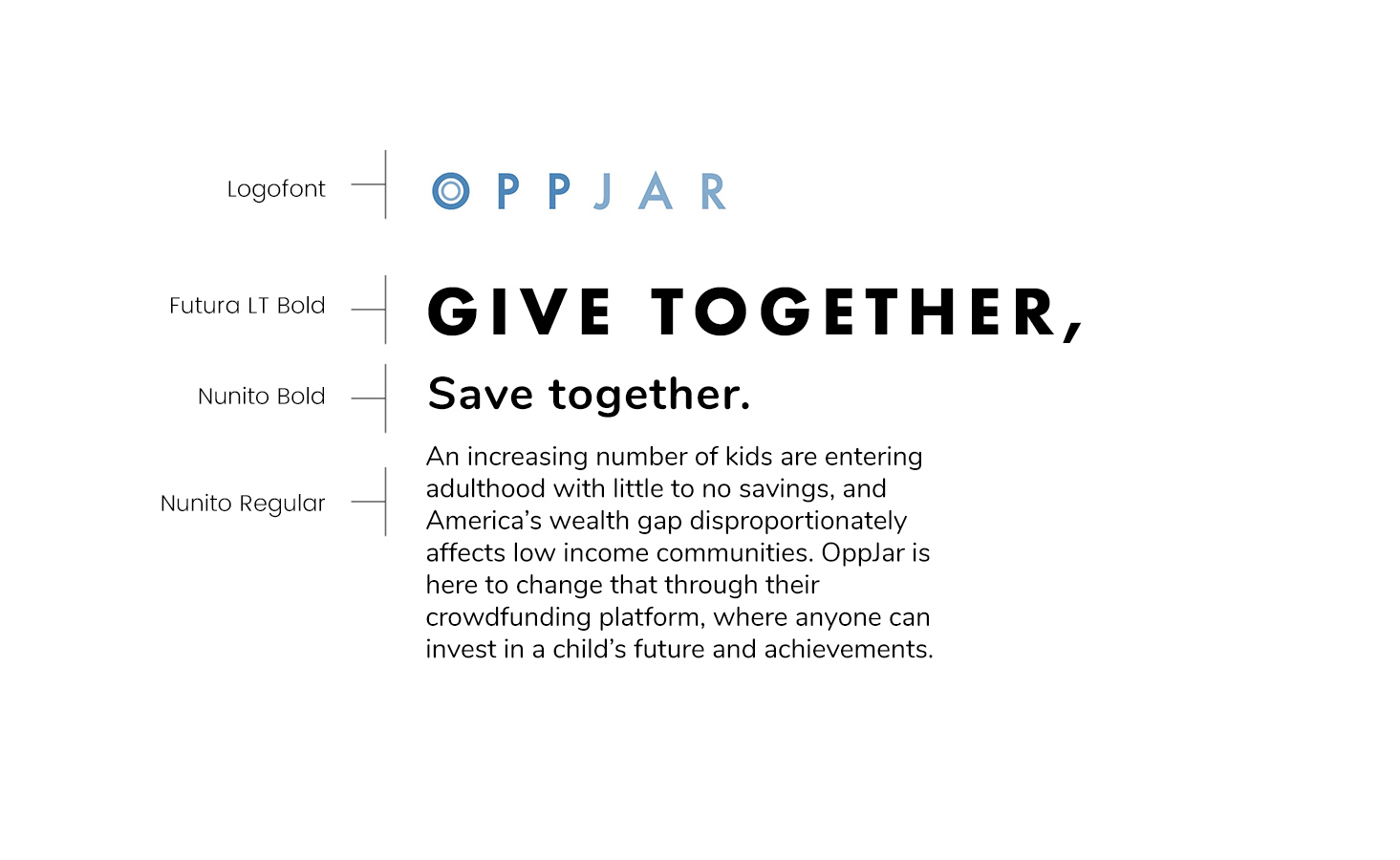
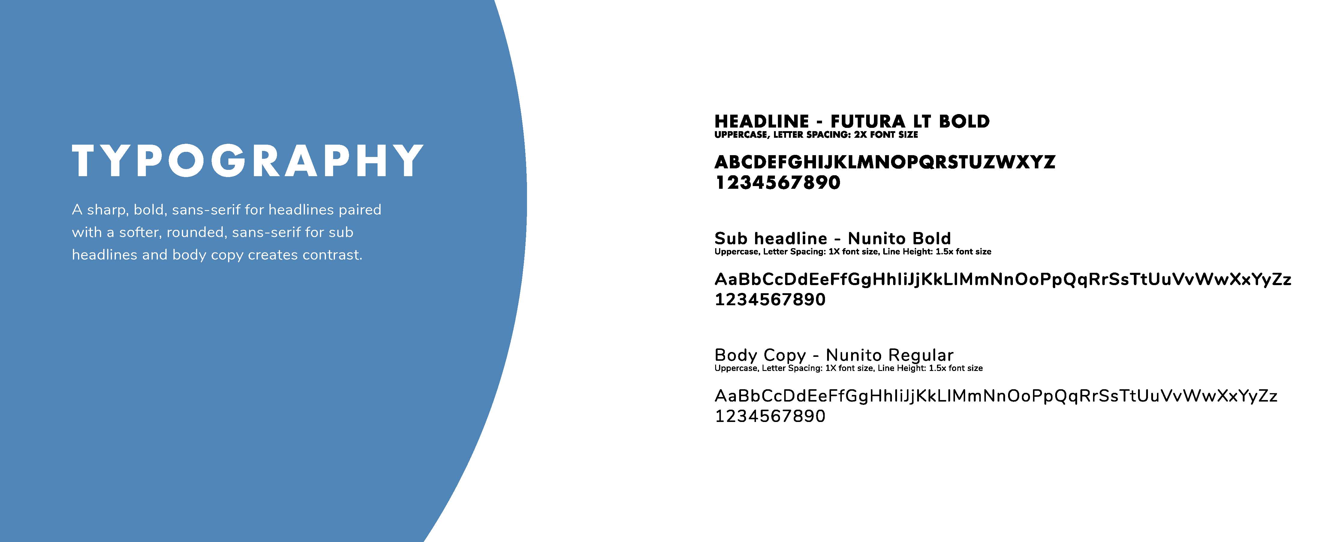
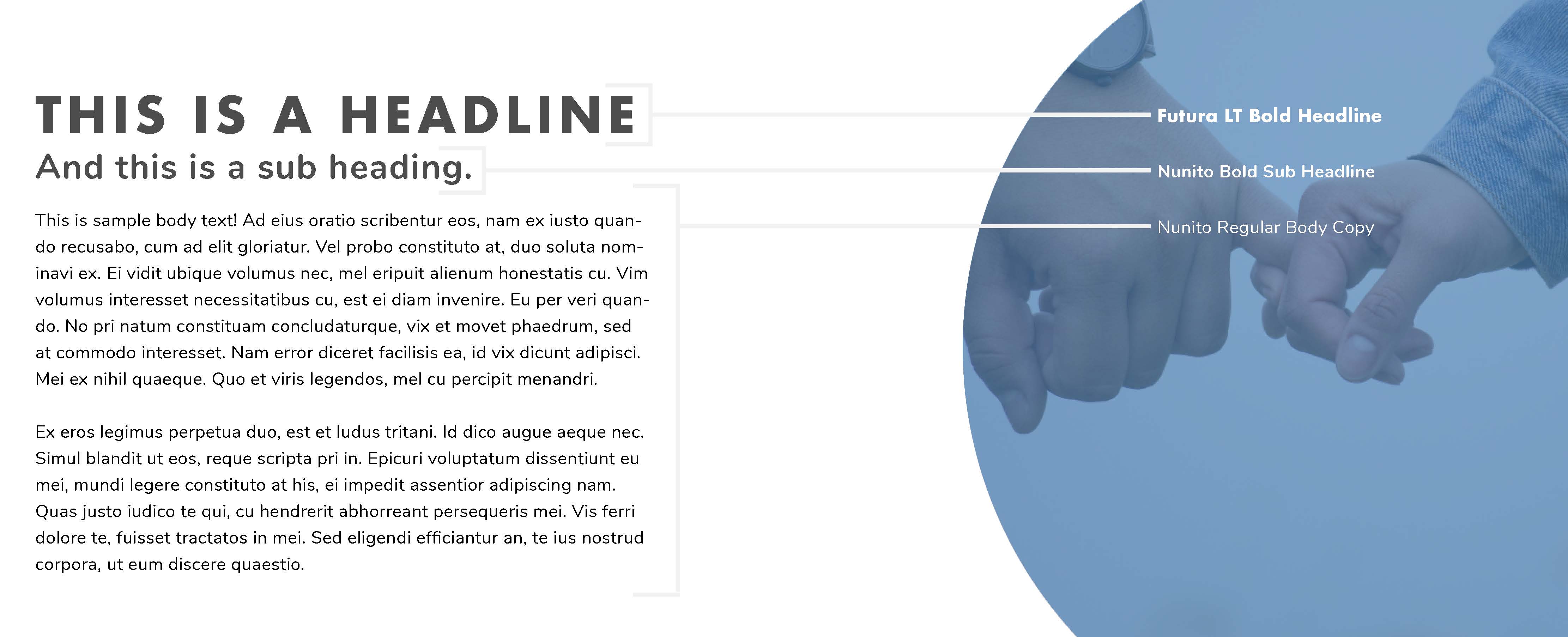
For OppJar’s typefaces we chose Futura and Nunito. For the logo and headlines we use all caps to make it bold and strong, and added heavy kerning to make it child-friendly and fun. To complement the strong, sharp Futura font, we paired it with Nunito, a rounded sans-serif. Nunito adds a relatable, approachable, younger feel to the type treatments.
